Campfire Design System
Campfire defines design and development principles for the DISH enterprise. It contains reusable elements for design and development for digital assets and acts as a holistic repository for things DISH Design knows. It's built to be inclusive, efficient, and transparent.
October 2018 - Present | Enterprise
OVERVIEW
Have you ever looked at a series of products that fall under the same brand but could not look more disconnected? That’s what the digital landscape for DISH was looking like circa 2018. The account management tool, the marketing site, and the product player looked so unique that if you removed the DISH logo you wouldn’t even know they fell under the same line of business. With the collaborative efforts of fellow designers, developers, marketing partners, and business stakeholders we set out to create a collection of reusable components that could be used across any of the enterprise’s digital assets. Challenge #1: How do you create an enterprise-wide design system when there isn’t one singular source of truth and digital voice?
MY CONTRIBUTIONS
I am one of the founding members and evangelists of Campfire at the company. I worked with fellow designers on each of the component’s conception, Sketch symbol builds, Invision DSM migration and the hand-off to development for each individual React component. This was a grassroots effort led by a small but mighty team of designers.

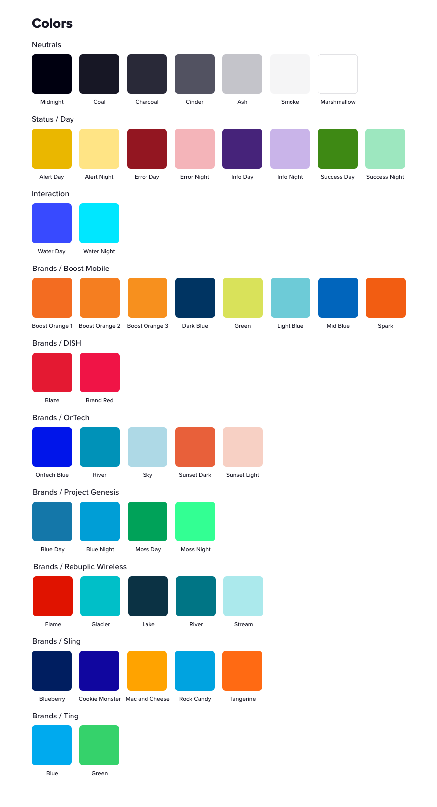
Colors used in Campfire; we aim to keep the neutrals and status colors the same across all brands, utilizing the brand specific colors subtly

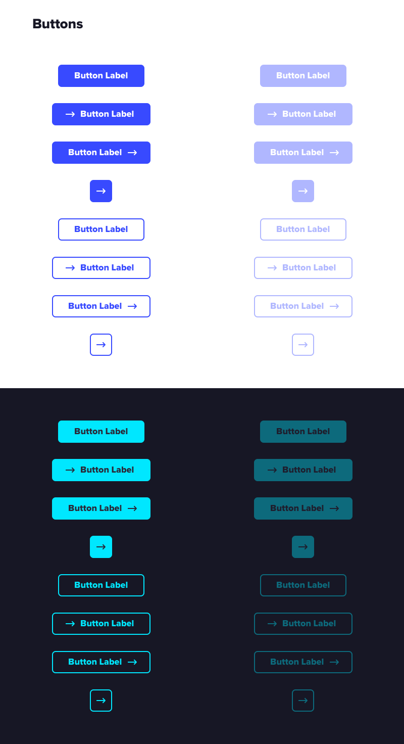
Button states in both day and night mode

Text input fields in both day and night mode

Just a few of the elements that can be found in the Campfire Design System

An example of a Campfire checkout experience used across two different platforms

