MyDISH Redesign
MyDISH is a customer-facing account management site for DISH’s satellite television service.
October 2018 - December 2021 | DISH
PROJECT OVERVIEW
In October of 2018, I was brought onto a project that would completely overhaul DISH’s customer-facing account management site, MyDISH. This project alone was no small feat. The aesthetic of the site hadn’t quite progressed over the years and the development team needed to merge two domains into one. The team made the decision to use this project as a catalyst for building out an enterprise-wide design system that could be leveraged across each line of business at DISH Network. And that’s how DISH’s enterprise design system, Campfire 🔥, was born. We often refer to the MyDISH Redesign as the pilot. It was the start of not only our design system but a more comprehensive, full-scale design process.
THE PROCESS
The dashboard we created to categorize and organize the user feedback processed on the current day MyDISH site.
Gather Initial Feedback
This being my first project at DISH, I wanted to dive right in. I immediately began digging into data from the current site. I created a weekly process and spreadsheet for categorizing and analyzing the feedback we had passively collected over the previous year. We reviewed that feedback with the stakeholders and determined our users’ most significant pain points as well as things they loved about the current site.
Know Our Audience
It’s no surprise that DISH’s customers skew a bit older and a bit more rural. Satellite TV will continue to be a crucial resource in rural America until quality access to high-speed Internet is continuous across all areas of the country. Our team worked with folks from our retention and marketing departments to determine who the key demographic groups were that we needed to design for as well as to test with. Challenge #1, how do you design a product that will be employed as a pilot for a large-scale design system based on modern, elegant design patterns for older folks running on 1GB download speeds?
Interview Our Stakeholders
Who better to know the ins and outs of a flow than the subject matter experts themselves? I sat down with individual stakeholder groups from different areas of the business (billing & credit, retention, sports programming, etc.) to get a better grasp on existing pain points and gather their feature wishlist. This step was crucial for getting buy-in especially on flows that spanned multiple areas of the business.
A results document showing the proposed navigation and the insights gained from a round of tree testing.
Build the Navigation
The next step was working with our business partners to build out a comprehensive, intuitive navigation that could be utilized on both the marketing and retention sides of the site. Our combined teams spent hours crammed in a room analyzing the web traffic data determining what we believed to be the most organic hierarchy. I ran a card sort with internal stakeholders and a series of tree tests with DISH customers to reach our perfected navigation structure.
A series of mobile MyDISH pages designed using Campfire.
Design the Product
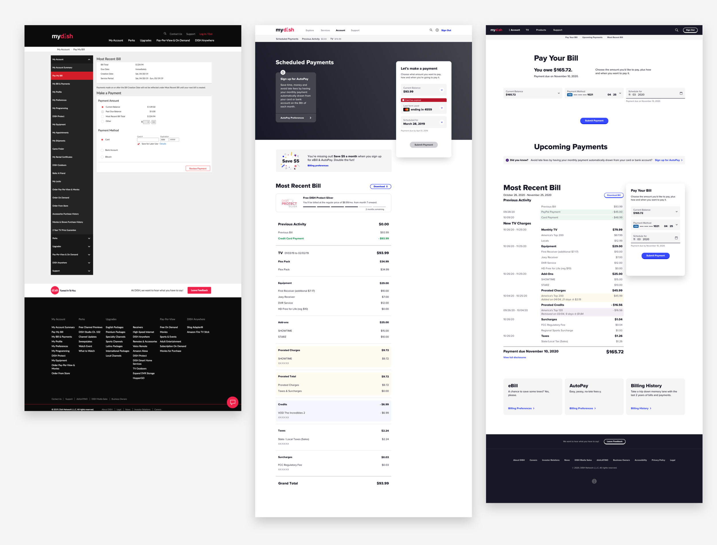
Based on data, we knew the number one reason users visited MyDISH was to pay their bill. This gave us a great starting point. We leveraged design patterns from our much more popular mobile app that based on data we knew were far outperforming the web. We added features that users were requesting (i.e. future dated payments, allowing for additional types of payment methods, giving users context of what they are paying for in-flow, etc.) and removed some overseen, lingering dark patterns.
One of the many remote unmoderated usability testing on MyDISH.
Test, Test, and Test Again
Now that the portion of the site that made up 70% of the traffic was complete, we wanted to get it in front of real users. I worked with another researcher on my team to set up, recruit, and co-moderate in-person interviews with DISH customers. This was a huge feat for us. It was the first time we had been able to utilize real DISH customers to test our designs prior to development. Challenge #2: How do we grow our research efforts to reach a larger audience in a shorter amount of time in a more sustainable fashion? We have since been able to add unmoderated testing utilizing a remote testing tool called UserZoom to our toolbox which has greatly impacted how quickly we can get user feedback on our designs.
Tell Our Story
I analyzed the feedback, made updates to the designs, and presented our latest and greatest prototype to our Executive Leadership Team. I told the design team’s story shedding light on things like why we used blue as our primary interaction color. I told our business partners’ story shedding light on why it’s important to give our customers the freedom to schedule a payment that more closely aligns with their paycheck. And I told Al’s story, the 65-year-old from rural Colorado who used TV to connect with his grandchildren.
Get Dev on Board
Our designs now had the business’ features, executive approval, and most importantly users’ validation. We needed to hand them off to development but wanted to take a different approach than we had in the past. Our team met with the lead developer on an almost daily cadence, ensuring his team had any HTML, CSS, or Javascript they may need in order to implement the most pixel-perfect version of our designs. We worked closely to ensure the React design system components could be scalable across multiple applications. For more about the implementation of the design system, check out my work on Campfire.
As we all know, the design process is an iterative cycle. It didn’t end here and still continues to this day. We continue to tackle other parts of the site in the background, building out an application that puts the users at the forefront of our designs.
MY CONTRIBUTIONS
I’ve worn many hats in regards to the MyDISH redesign project. I worked with other designers to create the look and feel of the redesign, evolved the design system, led the research efforts to get our designs in front of DISH customers prior to development, and lastly, I stood as a storyteller in front of our Executive Leadership Team.

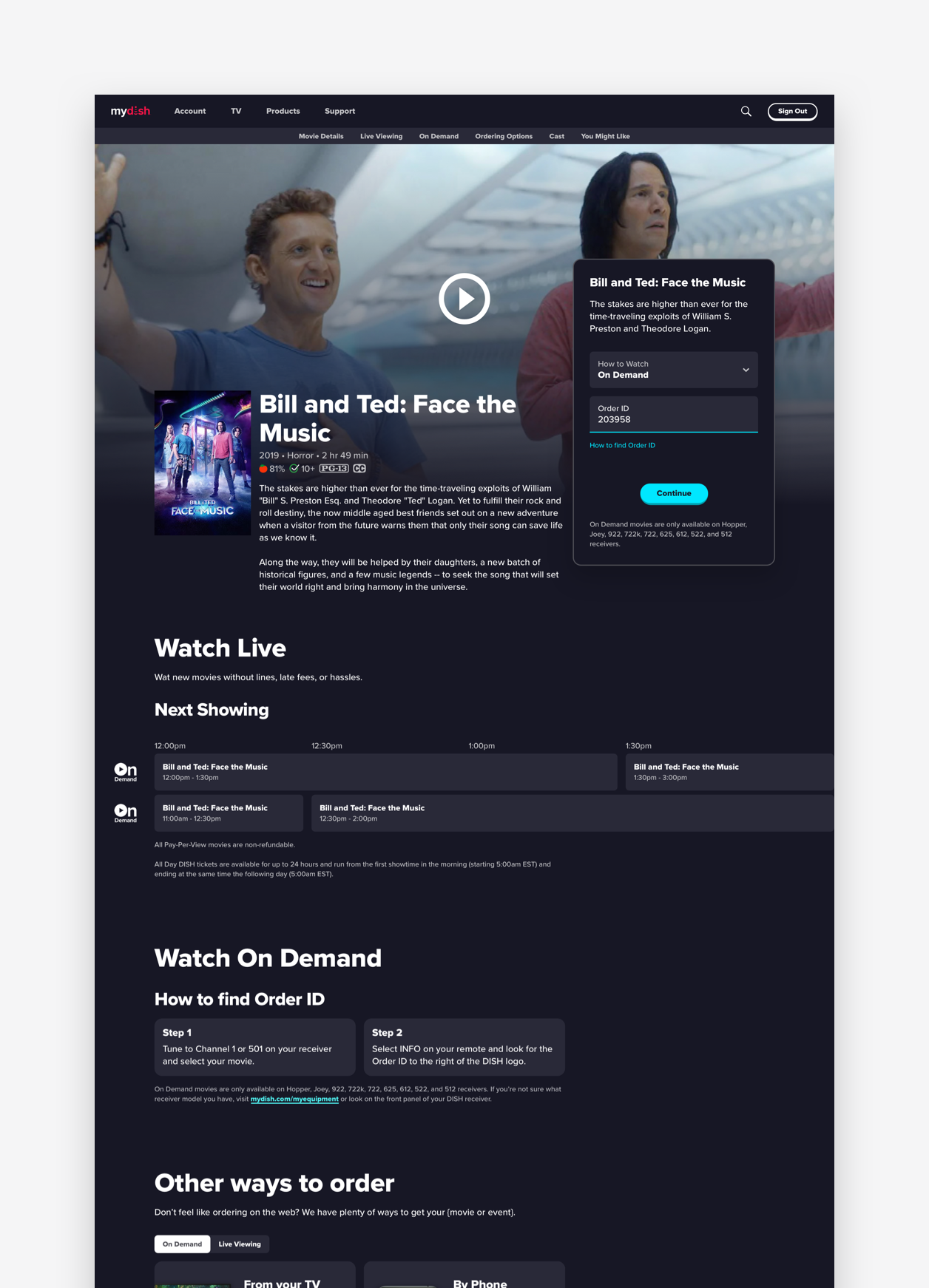
PPV and OnDemand section, highlighting new movies and getting people excited to watch new films

Movie details page, we wanted to give users context around what they were paying for

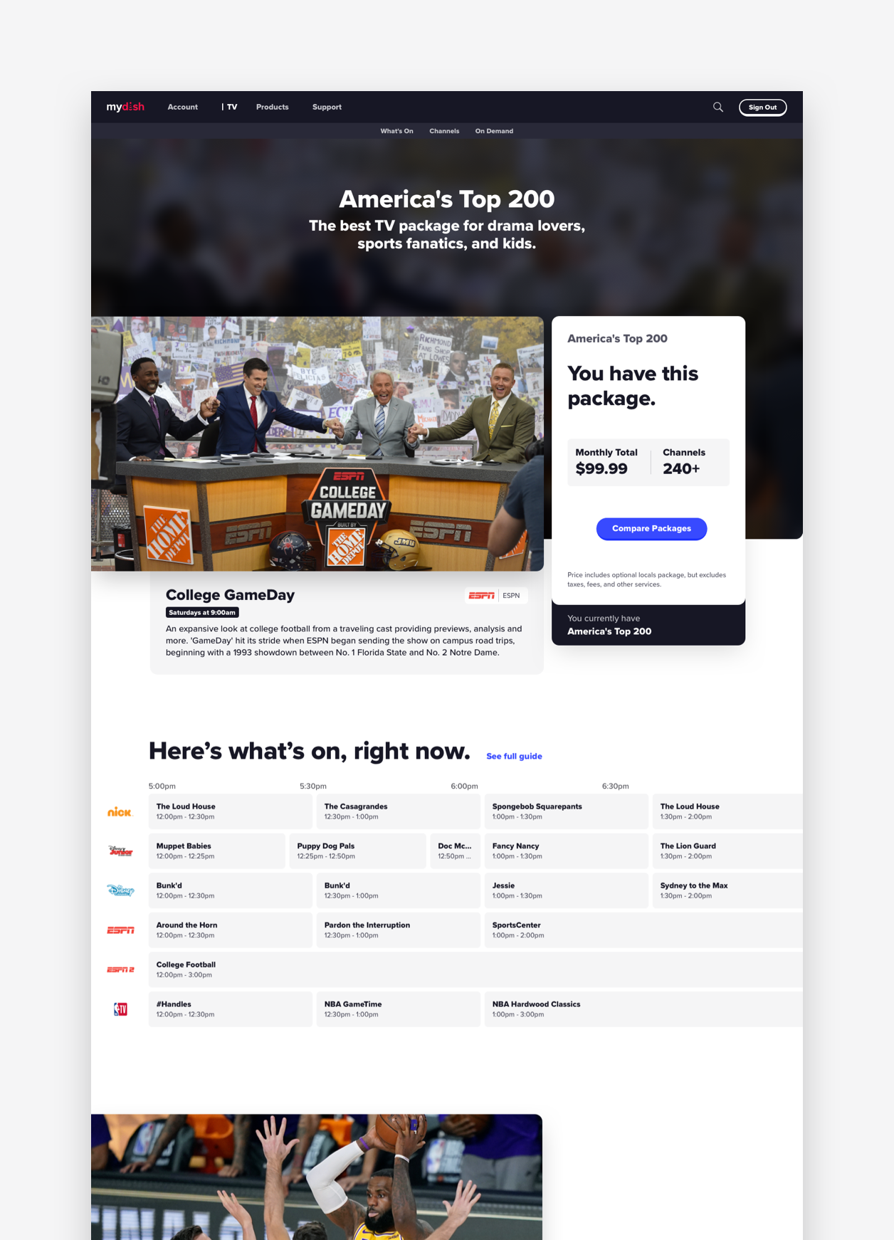
Core package details page for an upgrade, highlighting any differences this package may have versus your old one

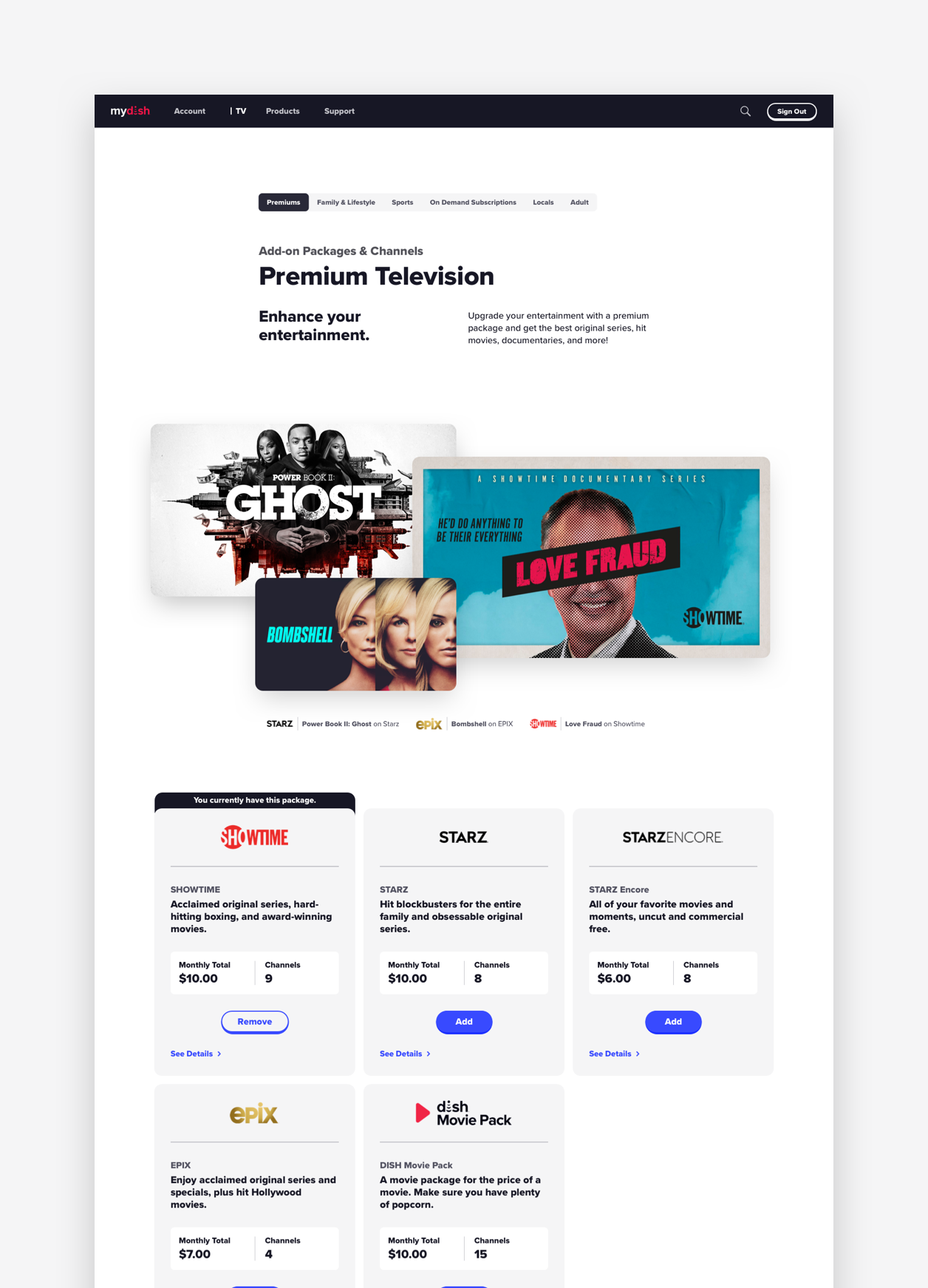
Add-Ons page specifically the premium channels, these are our biggest sellers, so we wanted to ensure they were treated like it.

The evolution of the Pay Your Bill experience. The far left shows MyDISH Pay Your Bill prior to the redesign, the middle shows the first iteration, and the far right shows where we it lives today


